Reading: Denver Health App: Q2 Design Update
Lectură: Actualizarea de design pentru aplicație. Citești un text despre inițiativele de produs dintr-o companie de sănătate, observând cum se comunică rezultatele și cercetările efectuate.
Чтение: Обновление дизайна приложения. Вы читаете текст о продуктовых инициативах медицинской компании, замечая, как сообщаются результаты и проведенные исследования.
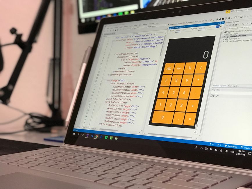
Denver Health App: Q2 Design Update
Welcome to our Q2 design update for our wellness application based in Denver, Colorado. Sarah, James, and Olivia have been leading our product initiatives this quarter, focusing heavily on user satisfaction and streamlined workflows across all platforms.
Over the past three months, we've shipped a major feature that allows users to track their daily water intake more easily. Current users have been loving the new minimalistic interface, and our engagement metrics have jumped by twenty percent since April.
James and Olivia have also been running a comprehensive research round with thirty participants in the local area. They've discovered that people don't want more complex menus; instead, they want faster access to their basic workout stats without clicking twice.
Our design team has spent countless hours iterating on the onboarding flow to make it as frictionless as possible. We've tested three different prototypes in Figma and conducted remote usability sessions with users from Boston and Seattle.
As a hybrid team with office days on Tuesdays and Thursdays, we've relied heavily on async communication tools. This setup has helped us maintain a high velocity while avoiding unnecessary meetings that slow down our creative momentum.
One ongoing project has been the redesign of our premium subscription page. We've updated the typography, improved the color contrast for better accessibility, and added clear success criteria for our conversion goals.
However, our biggest achievement this quarter wasn't something we added to the app. After looking back on user feedback, we decided to completely remove the cluttered social sharing widget that nobody was using.
Removing that widget turned out to be our best decision yet. App performance improved, loading times dropped, and user complaints about interface clutter stopped entirely. Sometimes deleting bad design is better than shipping new features.
Read again and choose the right answer
What city is the wellness application based in?
- Denver
- Boston
- Seattle
What feature did the team remove?
- Water tracking
- Social sharing widget
- Subscription page
How many participants were in the research round?
- Ten
- Twenty
- Thirty
What days are the office days for the hybrid team?
- Monday and Wednesday
- Tuesday and Thursday
- Friday only
Sources: photo by Eduardo Rosas on Pexels
Despre această lecție
Acest curs online de engleză pentru designeri din Chișinău și alte orașe este adaptat special pentru profesioniștii din IT care lucrează cu echipe internaționale. Vei învăța să vorbești despre proiecte recente, să prezinți rezultate și să participi activ la discuții de echipă.
Об этом уроке
Этот онлайн-курс английского языка для дизайнеров из Кишинева и других городов создан специально для IT-специалистов, работающих в международных командах. Вы научитесь рассказывать о текущих проектах, представлять результаты и активно участвовать в обсуждениях.