Reading: This week's redesigns: brilliant or boring?
Lectură: recenzii pentru redesign de aplicații. Citești o rubrică săptămânală despre reamenajarea unor interfețe și opiniile specialiștilor despre acestea. Analizezi detalii despre culori, pictograme și experiența utilizatorilor pe diverse dispozitive.
Чтение: обзоры редизайна приложений. Вы читаете еженедельную рубрику об обновлении интерфейсов и мнениях экспертов о них. Вы анализируете детали о цветах, иконках и пользовательском опыте на различных устройствах.
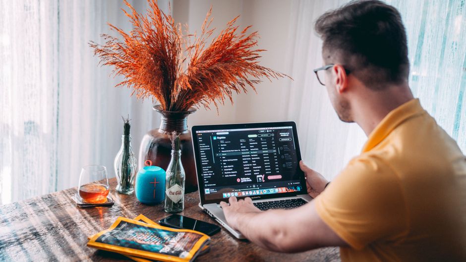
This week's redesigns: brilliant or boring?
Welcome back to our weekly design review column. I'm Amber, and today Noah, Rachel, and I are looking at three brand new app redesigns that just hit the App Store in Denver and Seattle. Let's dive straight into the first one.
The first app on our list is 'TaskFlow', a project management tool for remote teams. The team behind it decided to migrate from an older interface to a brand new dark mode look. Our research round showed mixed feelings among users.
Noah thinks the new layout is stunning and extremely striking. He loves the refreshing color palette and the smooth switch tools experience. However, Rachel finds the dark purple gradients a bit overwhelming for daily use.
Next up is 'CookBook', a recipe app that recently shipped a feature for meal planning. The previous version was quite bland, so they added large, vibrant photos and a redesigned flow for finding quick dinners.
Rachel was thrilled with the new food photography, calling it fascinating and very eye-catching. I must admit, the layout is impressive, but some older users might find the tiny icons a bit dated.
Then we have 'CityTransit', an app for bus and train schedules in Seattle. The interface uses bright yellow text on a bright green background. To be honest, it is absolutely terrible to look at.
Noah was exhausted by the clashing colors, and my gut reaction was that it would totally fall flat. The contrast is awful, and key stakeholders should be embarrassed by how it looks.
Yet, after testing it during my morning commute in the rain, I realized something surprising. It is the most useful transit app I've ever used because the big buttons work even with wet fingers.
Read again and choose the right answer
What is the name of the project management app reviewed in the column?
- TaskFlow
- CookBook
- CityTransit
How does Noah describe the new layout of the first app?
- Bland and dated
- Stunning and striking
- Exhausted and boring
What did CookBook recently ship according to the text?
- A dark mode interface
- A meal planning feature
- A ticket booking system
What did Amber discover about the terrible-looking CityTransit app?
- It is actually the most useful transit app she has used.
- It makes her feel exhausted by the complex navigation.
- It was rejected by all key stakeholders in Seattle.
Sources: photo by Sami Abdullah on Pexels
Despre această lecție
Descoperă cum să discuți concepte vizuale și să oferi feedback sincer în engleză folosind adjective puternice. Acest curs este creat special pentru designeri digitali din echipe de produs și agenții.
Об этом уроке
Узнайте, как обсуждать визуальные концепции и давать честный отзыв на английском языке, используя сильные прилагательные. Этот курс создан специально для цифровых дизайнеров из продуктовых команд и агентств.